LOGOS / ICONS
Designing a logo can be a very personal thing for a client. Each logo I design tells a story, and nothing makes me happier than bringing someone's vision to life.
̌

Hanloh is a pop-up restaurant that focuses on modern Thai fusion. "Hanloh" in Thai means "hello," so when crafting the logo I made it into the shape of a speech bubble and hand-drew the letters to evoke movement and playfulness. It lends itself really well to being used with photography, and creates endless opportunities for fun social media variations, and becomes a natural tie-back to the symbolism.

It was important to the founders of Eian’s Local to incorporate the image of Eian - one of the founder’s son who has passed away, and an image of a heart, because the market and pub house will be located in Loveland Colorado. My goal was to make this very personal logo symbolize vibrancy and celebration.
App developer, Meatfreezer Apps, was developing an IOS art career management app called, MF Artist. This app allows artists to catalog their work in different layers, such as: name, price, title of a piece, and the contact information of their collectors. I was commissioned to design the MF Artist logo. I crafted the logo to have a “layered” look, that reflected the different layers of organization available within the app. The layers of the logo were in the shape of an "A,” tying it back to the name of the app. Released in Apple app store.

App developer, Meatfreezer Apps, was developing an IOS productivity app called My Work, which provides a kanban-style interface to Pivotal Tracker. I was brought in to design the logo for My Work. In discovery with the developer I learned that the logo needed a friendly-feel. With that in mind, I opted for a calm color palette and a happy, round font. I also illustrated the tab icons that were used within the app, giving them the same friendly treatment. Released in Apple app store.


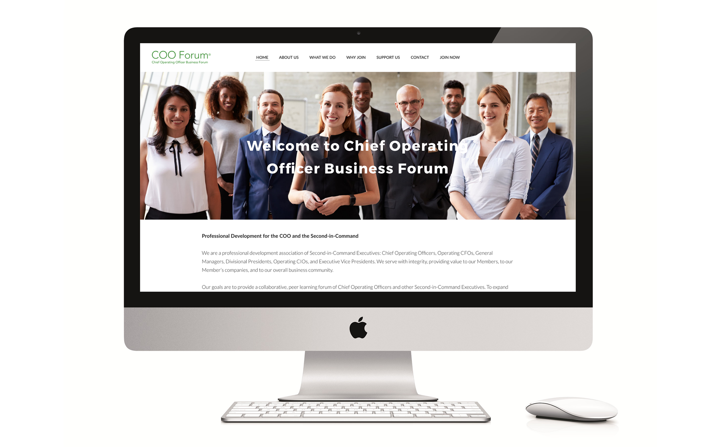
Chief Operating Officer Business Forum went through a rebrand. I created a new logo for the brand and a logo for their online service called COOeForum®. I created the designs to meet the client’s need of reaching a high-end clientele and instilling trust in their services.

10ACITY is a logo created as an inspirational message for a local girls soccer team. One of the team member’s parents thought t-shirts with this logo would be a great way to symbolize that all their hard work is paying off.

Executive Wellness Coaching company Connected EC was going through a rebrand and wanted a new logo that reflected the values of the company. CEO Jamie Shapiro resonated with the tree symbolism because it represented growth. I designed the logo to have an implied human shape. The branches subtly spell out the letters of the company in order to personalize the logo even more.


This is a logo study for skin care company Bloom Face + Body. To represent the action of blooming I painted a floral image using gouache, and used it as a motif throughout the designs.


Chad Herst wanted a cohesive set of icons for his website that represented the different service categories he offered. I was brought in to illustrate and produce the final web icons. Because Chad’s logo was already established, I made sure to craft icons that were on-brand and fit effortlessly into his brand’s identity.


